Tired of Fish - So-Called Art Today
Image by Boogies with Fish
www.messersmith.name/wordpress/2010/02/12/tired-of-fish-s...
I woke up this morning at 04:00 and withing thirty seconds realised that I was not going back to sleep without a Valium. Too late for a Valium. 03:00 is okay, but if I take one any later than that and I'll feel even sillier than usual for the first couple of hours in the morning at the office. Sometimes that a good thing, but I'm going to be a little too busy for day-tripping, as it is Friday. Mondays and Fridays . . . what can I say.
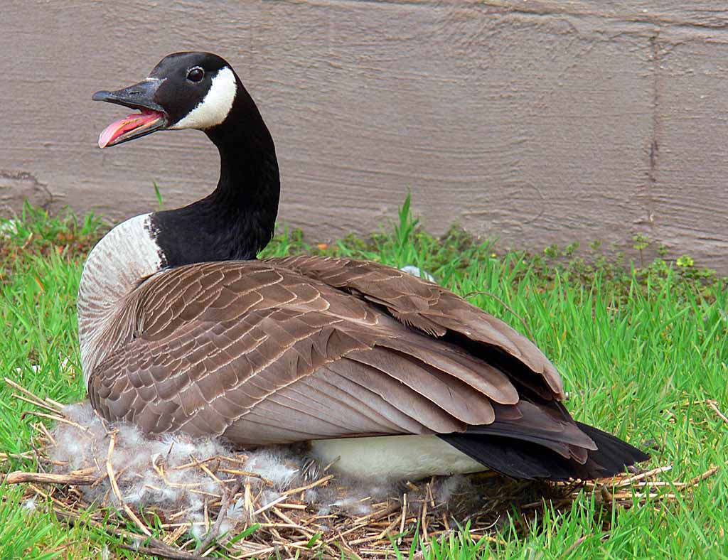
Since it was that time of the day when work seems intolerable, I decided to play. One of my favourite games is Make Something Into Something Else. You've seen this mama Canada Goose here before. I know, I know, some of you think of them as vermin, but I don't have to live with them crapping all over the place, so I can think of them as cute:
They nest in the most peculiar places.
This image was a good candidate for art because it's pretty simple. All I had to do was get rid of the cement block wall and punch up the colours with a few clicks and pretso-changeo, I've got art: If I had some more time, I'd find a nice woodland scene and paste it in the background. Maybe another day.
Here's a canoe that you've also seen here before: Again, a good subject because it's simple. The waves rolling in from a passing boat also give the image depth and a vanishing point at the horizon - a perfect starting point for art.
I first tried the Photoshop Poster Edges filter: You'll have to click all of these images to enlarge them to see the full effects. This one is interesting, but it is not what I'm looking for. The waves have taken over the image now and the canoe detail is lost in the filter effect.
The Watercolour filter is more of what I'm looking for: The waves are still there, doing their compositional job, but now the canoe is much more interesting, as is the water. The Watercolour filter is one of my favourites, but it's tricky and doesn't work at all for some images.
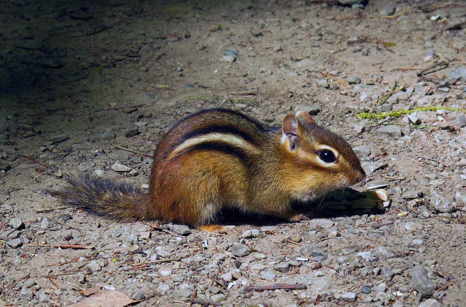
Here's another image you've seen here before and it too is simple: Cute little varmint, eh?
On the little Chipmunk, the Watercolour filter worked a treat: The only problem is that his teensy feet were lost in his shadow, so I had to fake them. They don't look like Chipmunk feet to me either, so don't bother to tell me.
Here is a nice, pensive shot of Carol Dover which you have also seen here before: Simple and poignant.
I first tried a weird filter called Smudge Stick. I don't like the sound of it, but it does sometimes yield interesting results: However, in this case, Smudge Stick is not my weapon of choice.
Call me Crazy (please), but I've always imagined writing comic books - not the kid's stuff. I have a sort of comic book brain; you wouldn't believe what goes on in there. Walter Mitty was brain dead compared to me. The problem is producing the art; the stories will take care of themselves. I've been working on some techniques for turning photos into comic strip illustrations. There are tons of products and lessons on the web for doing this and I've tried a lot of them, but never been satisfied with the results. They simply don't look comic book enough for me. So, I've developed my own ultra-secret technique which someday is going to make me a lot of money (yeah, sure): Remember, you saw it here first, folks. The MadDog Comic Book Generator. Just set up your story board, take your shots in the studio or wherever you like, pay me a lot of money for my secrets and do what I tell you and voilà - you're a comic book baron.
Look out, DC Comics. Here I come!

Adjusting the gamma curve
Image by selkovjr
Previous: Adjusting the exposure level
Spreading the contrast
The next improvement will be to distribute the "amount of contrast" more evenly among the lightness values. That is, we don't want too much differenence betwen the adjacent lightness values in the mid-range, as well as in the bottom part of the scale, except for a few values at the very bottom, where we do not percieve contrast very well, anyway.
To normalise this picture, the gamma curve must be made steeper in the dark range (at the cost of losing some of the contrast in the bright part of the range). Linearising the dark part of the curve serves to minimise the damage to contrast in te bright areas that would be brought about by the overall steepening of the curve. The smaller the extent of linearity, the steeper will be the linear part of the curve and more of the dark values will become visible. Dialing the gamma value down from 0.45 to 0.42 takes care of the overall contrast; reducing the extent of linearity from 0.1 to 0.04 lightens the shadows to an acceptable level. Getting at the best pair of numbers may be an iterative process: adjust the gamma, then linearity; try another gamma and adjust the linearity parameter to suit. If you cannot achieve the desired effect in, say, 3-4 iterations, it probably means the picture is bad enough to be discarded.
Now, it can be argued that doing so is warping the truth (and it is, in the literal sense of the word). The resulting image will look very differently in comparison to the original scene. Whether you want to do that or not, depends on your goal. If you want a faithful reproduction of the overal scene, stick to the standard gamma curve for the camera. On the other hand, if the purpose is to render the details of an object in the best possible way, uisng whatever light is available at the scene, then a lot of tweaking will be in order, because the outside lighting conditions are almost never good for that purpose.
The result in this case is a fair preservation of detail. Note that the new gamma curve has pulled some of the pixes that would have been underexposed away from zero (not that there were too many). The new underexposed fraction is 0.04% &almost; nothing.
Saturation
This gives me a satisfactory material to feed intto Hugin for panorama assembly (and it will do further adjustsments of its own). This is also how I would treat the regular single-frame pictures. The only other adjustment that I make at this stages is saturation. The best amount of saturation adjustment varies with the camera; I figured that my Fuji S9000 needs a factor of 1.2 to make things look right.
That is not always so. Some pictures need significantly more saturation; some less. For example, this picture looked awful until I desaturated it to 0.8. But in this case, 1.2 seems to work best (this screen shown shows the image before the saturation adjustment was applied).
The cameras do their own saturation adjustment when they save a compressed image; more often than not, their choice of the adjustment factor is awful. The technology strives to please the average consumer, who prefers cartoon-like coloring of his pictures.
Writing it down
Now that I have figured out the adjustments to make for each frame, I write them down in the form of make targets. The command lines involved are too cumbersome to type, so I write them once in the projects Makefile, then replicate as necessary. For this picture, the rule is:
aonach_dubh-f6.tiff: raw/080427_195321.RAF
ufraw-batch \
--rotate=90 \
--wb=camera \
--exposure=1.2 \
--gamma=0.42 \
--linearity=0.04 \
--saturation=1.2 \
--black-point=auto \
--interpolation=ahd \
--out-type=tiff \
--out-depth=16 \
--output=$ @ \
$ <
exiftool -overwrite_original -tagsFromFile=$ < -all:all $ @
(imagine tabs instead of spaces; I had to insert a lot of space characters into this example because flickr does not allow the formatting of the text)
This rule will run ufraw on the raw file (080427_195321.RAF) and store the output in aonach_dubh-f6.tiff. Additionally, it will run exiftool to copy the tags from the raw file into the resulting TIFF file (ufraw does not seem to do that with TIFF). Of particular interest at this stage are the lens tags, which will allow Hugin to calculate the field of view for each frame, but I copy all tags for simplicity.
Next: Making a panorama in Hugin: automatic alignment

Life in 2016
Image by Mirka23
"Rachel moves out to L.A., buys a hover vespa, and dyes her hair green.
In L.A., what you drive is as important as what you wear, in 2016."
One thing I suggested for my birthday art project was that people could make some kind of drawing or collage showing what my life will be like as I finally succumb to adulthood. So, my friend Matt made this collage/cartoon. Now, what I initially liked about it was that all of those seem like things that I would actually probably do! Looking at it again later, I am also amused that it seems that I won't actually be an adult for another 10 years. And even then, it's questionable. Haha!

No comments:
Post a Comment